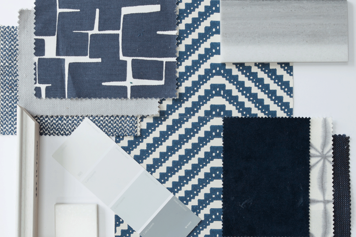
Blue is the colour
Pantone’s colour of the year for 2020 has been announced as classic blue. But what exactly is it about the world’s favourite colour that makes it so universally appealing?
Laurie Pressman, Vice President of the Pantone Colour Institute commented: “It’s a reassuring blue, full of calm and confidence. It builds connection.”
Which is exactly why we like it.
As Interior Designers, we implement the psychology of colour in all of our designs and use colour to create spaces that our clients walk into and intuitively feel connected to. The natural indigo shade, which is derived from plants and dyes, somehow manages to exude calm and reassurance, aid concentration and boost productivity, which makes it the perfect shade for work, rest and play.
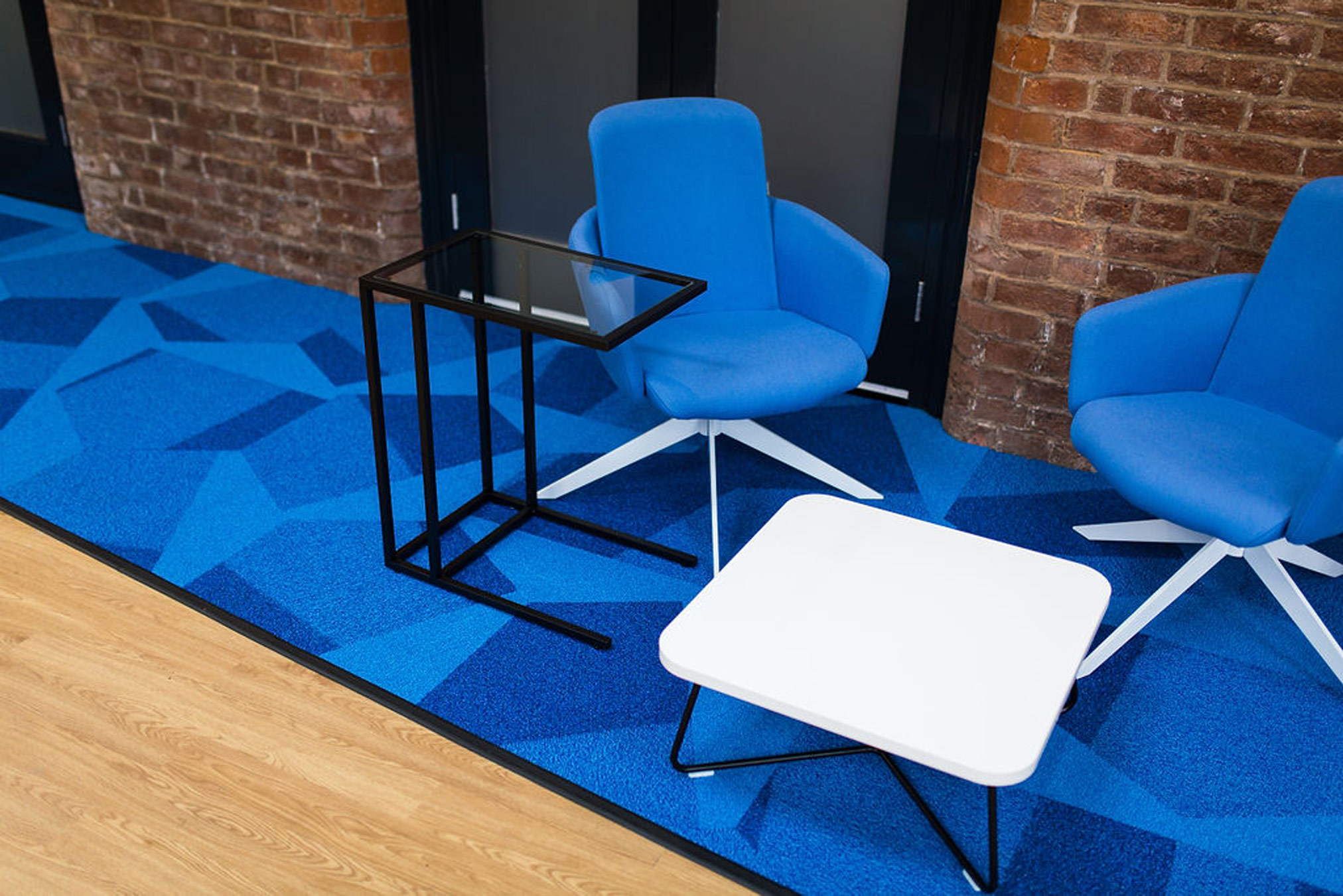
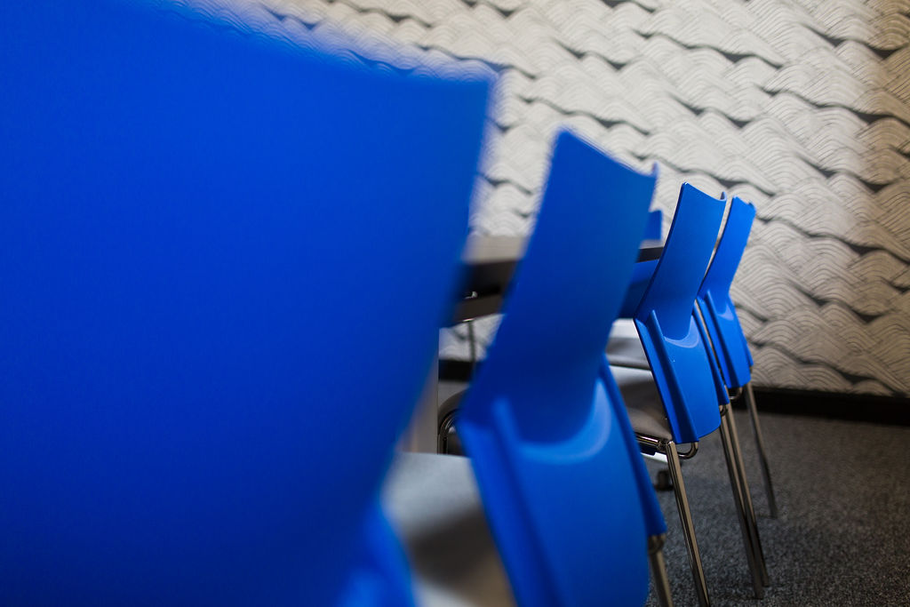
The perfect shade for meeting rooms and offices
Blue surroundings are thought to boost productivity and aid concentration. As well as improving your employees’ academic performance, blue is universally known as a stable and calming colour that will help your employees remain focused throughout the working day. It creates a warm and welcoming environment and suggests stability and trustworthiness, which is why blue is the perfect shade for receptions, meeting rooms, offices and communal areas. Blue spaces give the impression of an open, stable and welcoming company – something desirable to organisations.
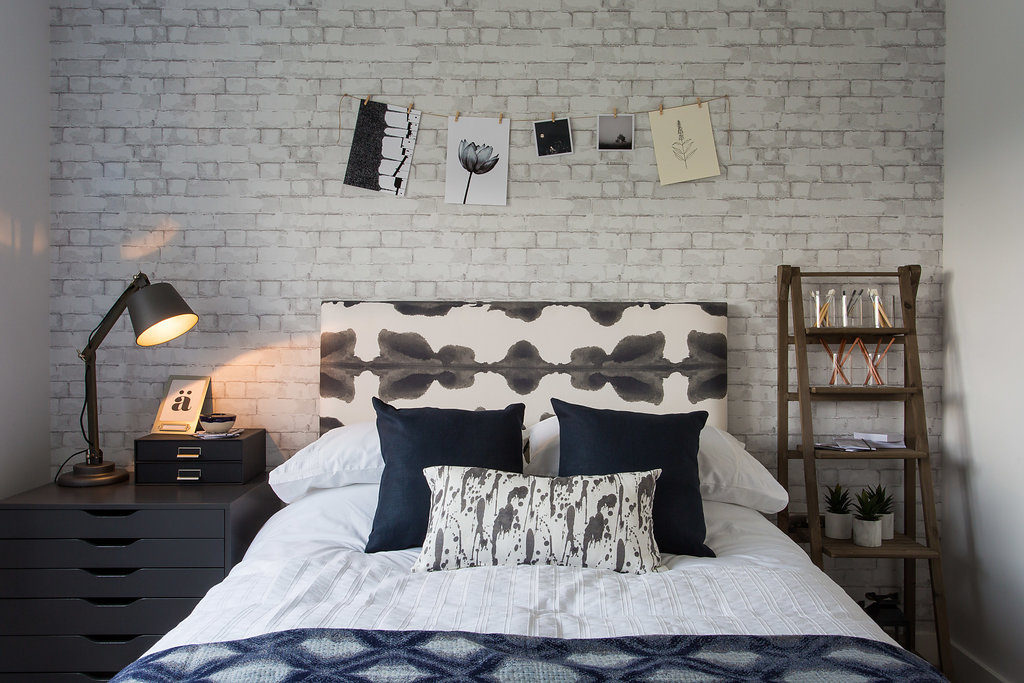
A reassuring shade for a beautiful home
So many of the beautiful show homes that we have created also feature this reassuring shade. Creating a cool and calm environment that is welcoming and universally appealing is so important when selling a home, a lifestyle, a dream. This gender-neutral shade can make spaces feel fresh and calm, or dramatic and deep. It is ever versatile, always timeless.
Natural, sustaining and grounding
Blue spaces are so popular because they feel safe – dependable, trustworthy, credible, and constant – all traits that are increasingly valued in the fast-paced, high-energy environments of the current world. Its links to nature – to the sea and sky – make blue feel natural, sustaining and grounding and fit perfectly with an increasingly important trend for natural materials and sustainable products and looks. Maybe we are all craving some stability in these turbulent times we face at the beginning of this new decade and need the reassurance of this classic shade in our surroundings.
To find out how Territory can help you with an upcoming residential or commercial development contact us today for a no-obligation conversation about your design needs.